Chesapeake Bay Program – Website Redesign
Improving access and usability within a complex, multi-agency system

Snapshot
- Role: Web Designer — Lead for Discovery & Design
- Scope: Information architecture, responsive design, and system patterns
- Context: Multi-agency public platform for environmental education, advocacy, and policy
- Focus: Modernizing usability within a legacy CMS and governance structure
Why This Work Mattered
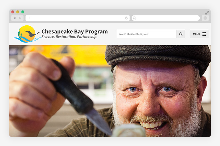
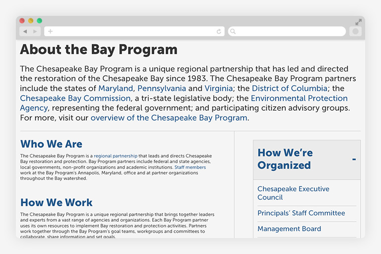
The Chesapeake Bay Program website serves as the primary public platform for a multi-state partnership focused on environmental restoration.
It supports a wide range of audiences—from educators and students to scientists, policymakers, and community members.
For many users, especially those working in the field, the site needed to function reliably in real-world conditions—not just on a desktop.
This work improved public access and usability without requiring a full system rebuild.
The Situation
The site needed to serve multiple audiences with very different goals:
- Educators and students
- Environmental advocates and nonprofits
- Scientists and policy stakeholders
- Residents and community members
At the same time, it operated within a legacy CMS and a complex multi-agency governance model.
The Real Problem
The system wasn’t failing because of content—it was failing because of structure and constraints.
- Desktop-first design made mobile use difficult
- Dense, content-heavy pages increased cognitive load
- Multiple audiences had competing needs
- CMS structure could not be significantly changed
The challenge wasn’t redesigning the site.
It was improving the experience without breaking the system that sustained it.
My Mandate
I was responsible for:
- Improving usability and navigation across devices
- Supporting multiple audiences with different needs
- Working entirely within existing CMS constraints
- Creating patterns that teams could maintain independently
This required balancing usability, flexibility, and sustainability.
Key Decisions
This work was shaped by decisions about constraints, access, and usability.
Design within the system—not around it
We worked with existing CMS structures rather than attempting a full rebuild.
Why: CMS changes would require significant cost and disruption. The system needed to remain operational during redesign.
Tradeoff: Limited structural flexibility, but faster delivery and long-term sustainability.
Prioritize mobile and in-field use
We shifted to a mobile-first approach focused on real usage conditions.
Why: Many users accessed the site in the field or on the go. Desktop-first layouts created friction in critical moments.
Tradeoff: Simplified layouts and reduced density, but significantly improved usability and accessibility.
Design for multiple “jobs to be done”
We structured content to support different audience needs:
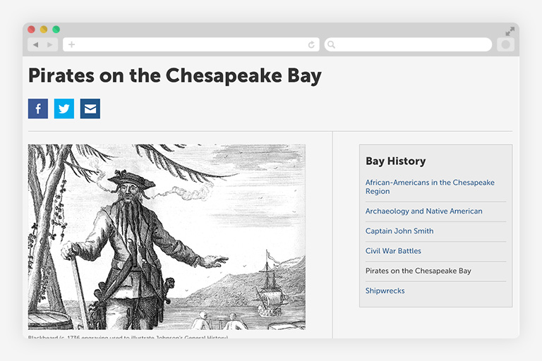
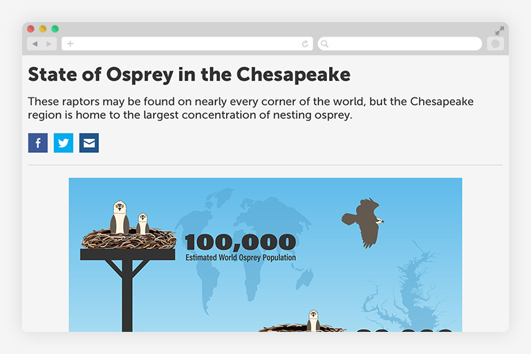
- Educators → structured learning content
- Advocates → multimedia storytelling
- Researchers → credibility and clarity
Why: A single hierarchy would not serve all users.
Tradeoff: Increased navigation complexity, but a more purposeful and usable experience.
Use patterns to reduce complexity
We introduced reusable layout and navigation patterns.
Why: Patterns reduce cognitive load and make updates easier for distributed teams.
Tradeoff: Less page-level customization, but greater consistency and maintainability.
What I Built
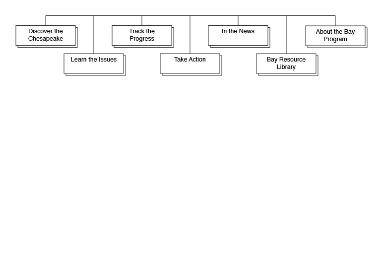
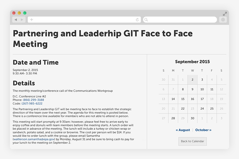
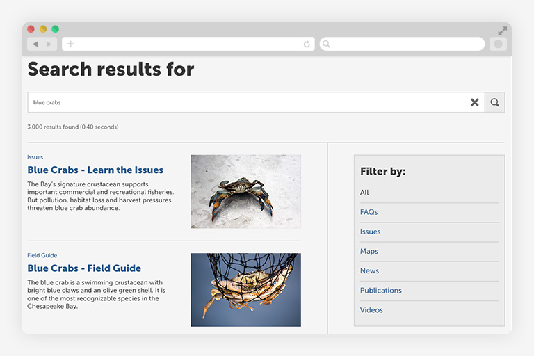
Responsive Experience Framework
- Mobile-first layouts
- Improved hierarchy and scannability
- Clear navigation patterns across page types
This made the site usable in real-world contexts, including in-field access.
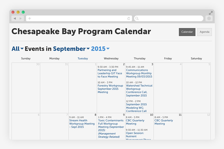
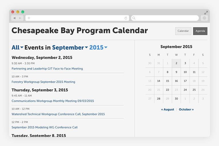
Pattern-Based Design System
- Reusable layouts for content-heavy pages
- Consistent navigation structures
- Flexible patterns supporting multiple content types
This enabled distributed teams to update content without introducing inconsistency.
How I Led
This project required collaboration across:
- Scientists and environmental experts
- Content strategists and communicators
- Developers and CMS specialists
- Federal and state partner organizations
My role focused on:
- Leading discovery and information architecture
- Aligning stakeholders across agencies
- Clarifying roles and responsibilities between teams
- Designing solutions that worked within real constraints
Clear boundaries and shared understanding reduced friction and prevented rework.
Outcomes
While formal analytics were limited, the redesign delivered clear improvements:
- Improved mobile usability for in-field users
- Reduced cognitive load through clearer structure
- Reusable patterns enabled easier content updates
- Increased confidence from teams directing users to the site
- Reduced navigation friction for multi-audience access
More importantly:
- The system became easier to maintain and evolve without disruption
What I Learned
- Constraints define the solution space—not limit it
- Accessibility is critical for public trust
- Systems must support the people who maintain them—not just end users
- Progress often comes from working within constraints, not removing them
How This Connects to My Work
This project reflects core themes that continue across my work:
- Designing within legacy systems: meaningful change without disruption
- Accessibility as public trust: usability supports credibility
- Systems thinking across stakeholders: design must work across teams and contexts
Download ZIP wireframes (71 MB) | Back » | Chesapeake Bay Program - Redesign